Project overview
This project was a conceptual redesign completed as part of the Visual Interaction Design course at the Estonian Academy of Arts. The course focuses on developing high-quality visual languages for interaction design. I chose to audit and redesign the MyFitness mobile app, a primary tool for thousands of gym members in Estonia, to explore how refined visual systems can enhance already functional products.
- Role: Lead UI Designer
- Duration: 6 weeks (Fall 2025)
- Tools: Figma
The Challenge
The primary challenge was to identify visual inconsistencies within an application that already performs exceptionally well from a functional standpoint. My task was to audit the existing interface, recreate its core components, and propose a redesign that mitigates visual friction while preserving the app’s established utility.
Research & Audit
As a frequent user of the app, I initially noticed no functional issues, however, through a detailed design audit and recreation phase, I identified several subtle but impactful issues:
- Inconsistent Typography: Varying typographic sizes made it difficult for users to distinguish between different levels of information.
- Layout Coherence: Minor misalignments and off-grid spacing reduced the overall visual unity of the interface.
- Information Hierarchy: A lack of intentional grouping made the screens feel less structured than they could be.
This led me to a hypothesis that the app’s reliability is what keeps users happy. This high level of performance hides the fact that the visual design lacks a consistent, unified system.
Solution
In my solution, I primarily applied an aesthetic lens to address visual inconsistencies. While the core functionality remained untouched, I introduced a few strategic functional adjustments by repositioning elements to improve the overall flow.
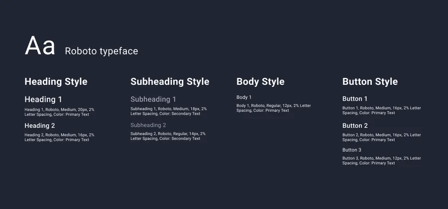
Creating a clear text hierarchy
- Typeface and System: To mirror the original Aktiv Grotesk font as closely as possible, I used Roboto with a 2% letter spacing. I then developed a mini typography system with two heading styles, two subheading styles, one body text style, and three button styles.
- Improving the Look: I kept the original button styles but updated the headings and subheadings to make the app much easier to scan.
Using a consistent spacing system
- Setting Rules: I introduced a 16px/32px spacing logic to create a more predictable visual rhythm.
- Following the Grid: Content sections are now strictly 32px apart, while cards and list elements stay 16px away from each other and their headings.
Simplified text hierarchy
Low fidelity prototype
Before moving to high-fidelity, I used a low-fidelity prototype to test the new text system and layout logic. Key changes included:
- Implementing text hierarchy and spacing rules: I applied the new 16px/32px spacing system and typographic scales to ensure that the most important information, like class times and club names, stood out clearly against secondary details.
- Cleaning up the Screen: I removed a redundant Call-to-Action (CTA) text that was unnecessarily taking up space above the booking button.
- Better grouping: I moved the “Club Capacity” button to the top of the screen to group it with other club-related information. Additionally, in the original design, it was unclear what this button did because it lacked a text label and used an ambiguous icon. Moving it allowed me to align it visually with other important buttons, ensuring a consistent hierarchy and making its purpose obvious to the user.
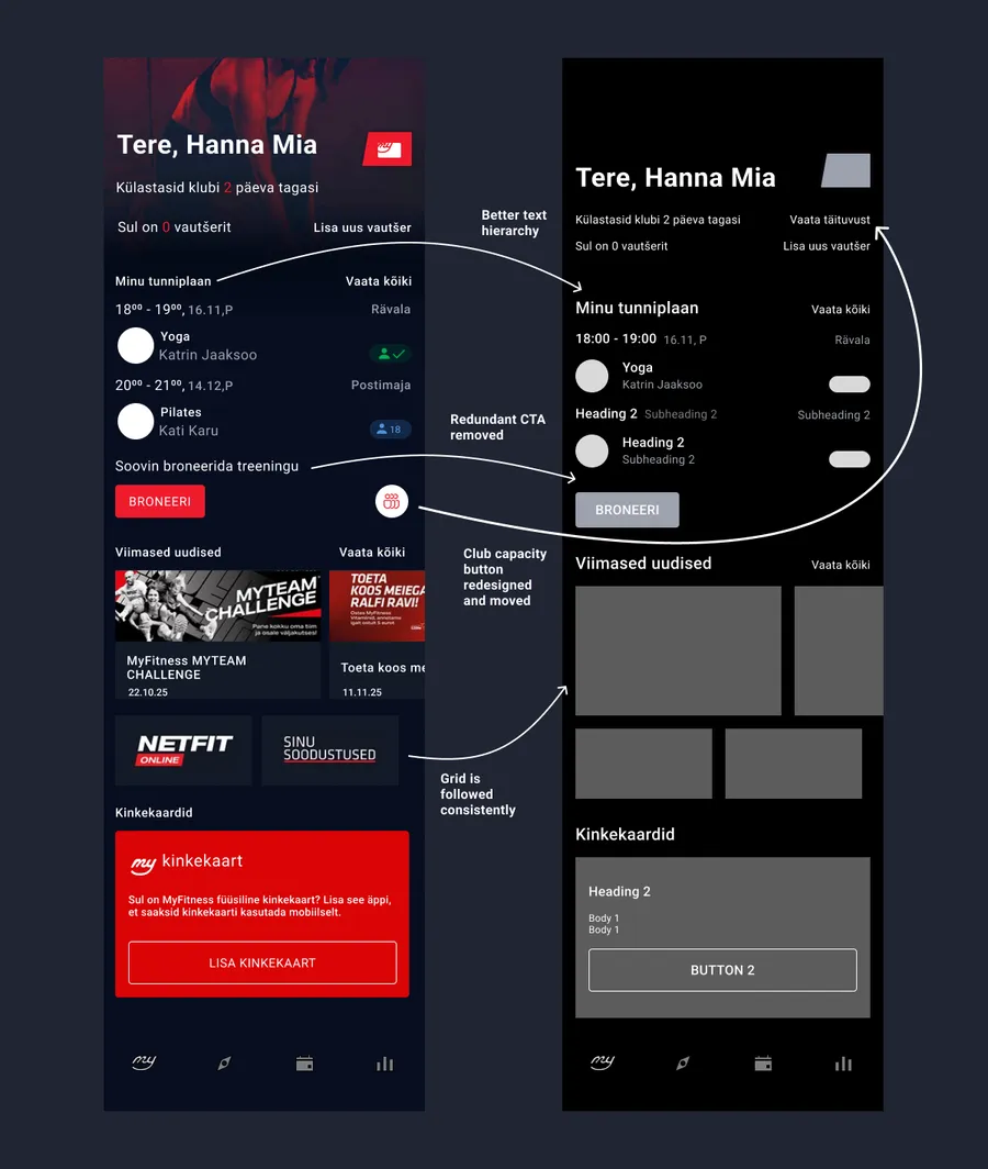
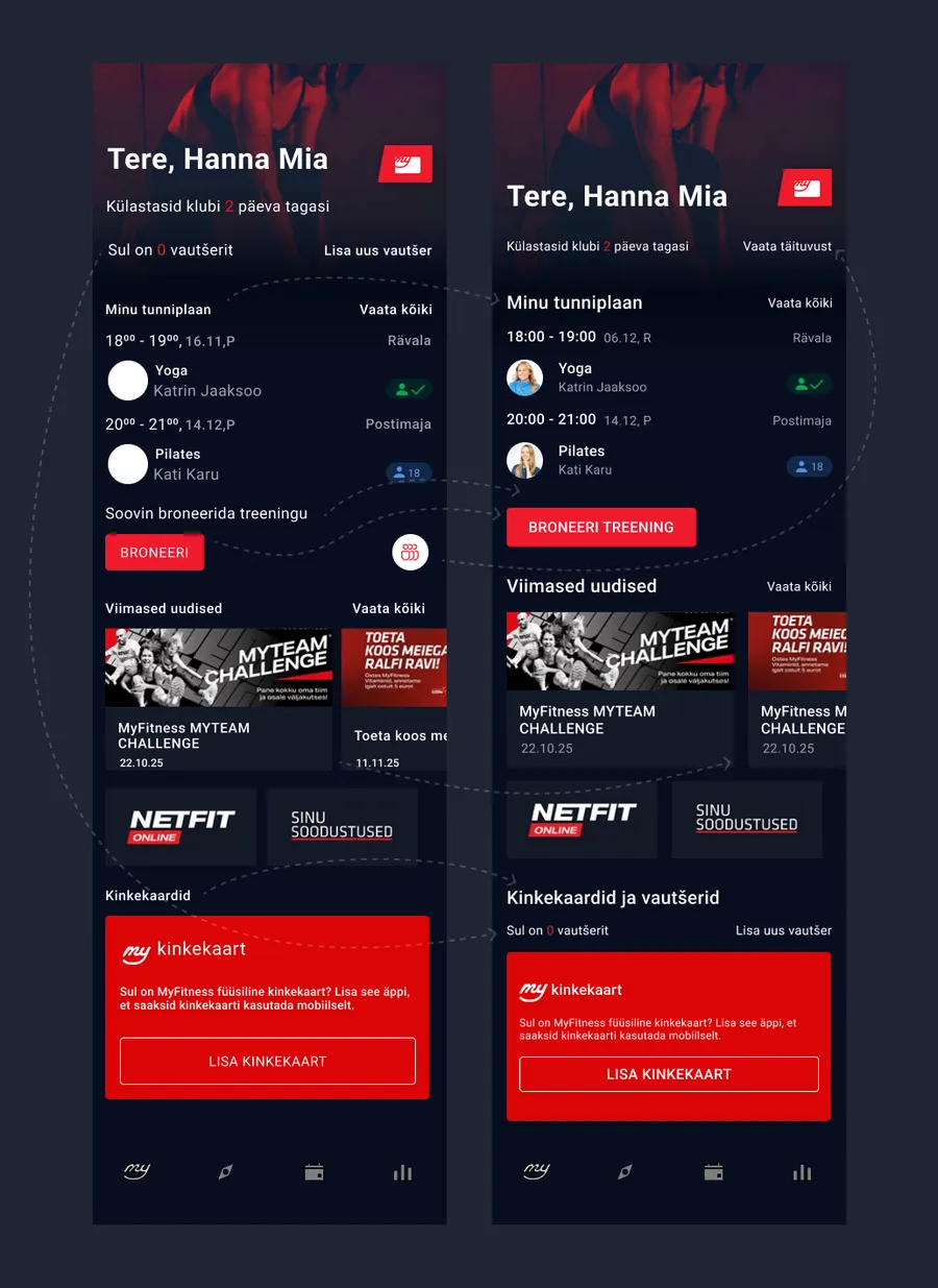
First changes for addressing layout issues
High fidelity prototype
I kept the original brand colors because I believe they already work very well.
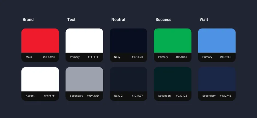
Documentation for the existing color scheme
To make sure my changes actually helped, I did some casual usability testing and made these final adjustments:
- More Regrouping by Theme: Testing showed that moving the capacity button made the top of the screen too crowded. I solved this by moving the “Voucher” section to the bottom into a new unified “Gift Cards and Vouchers” area.
- Making Actions Clearer: Based on feedback, I revisited the CTA issue that I had removed earlier. To make sure users still know exactly what they are clicking, I updated the booking button text from “Broneeri” (Book) to “Broneeri treening” (Book a class). This makes the action clear and minimizes confusion without needing extra text CTAs.
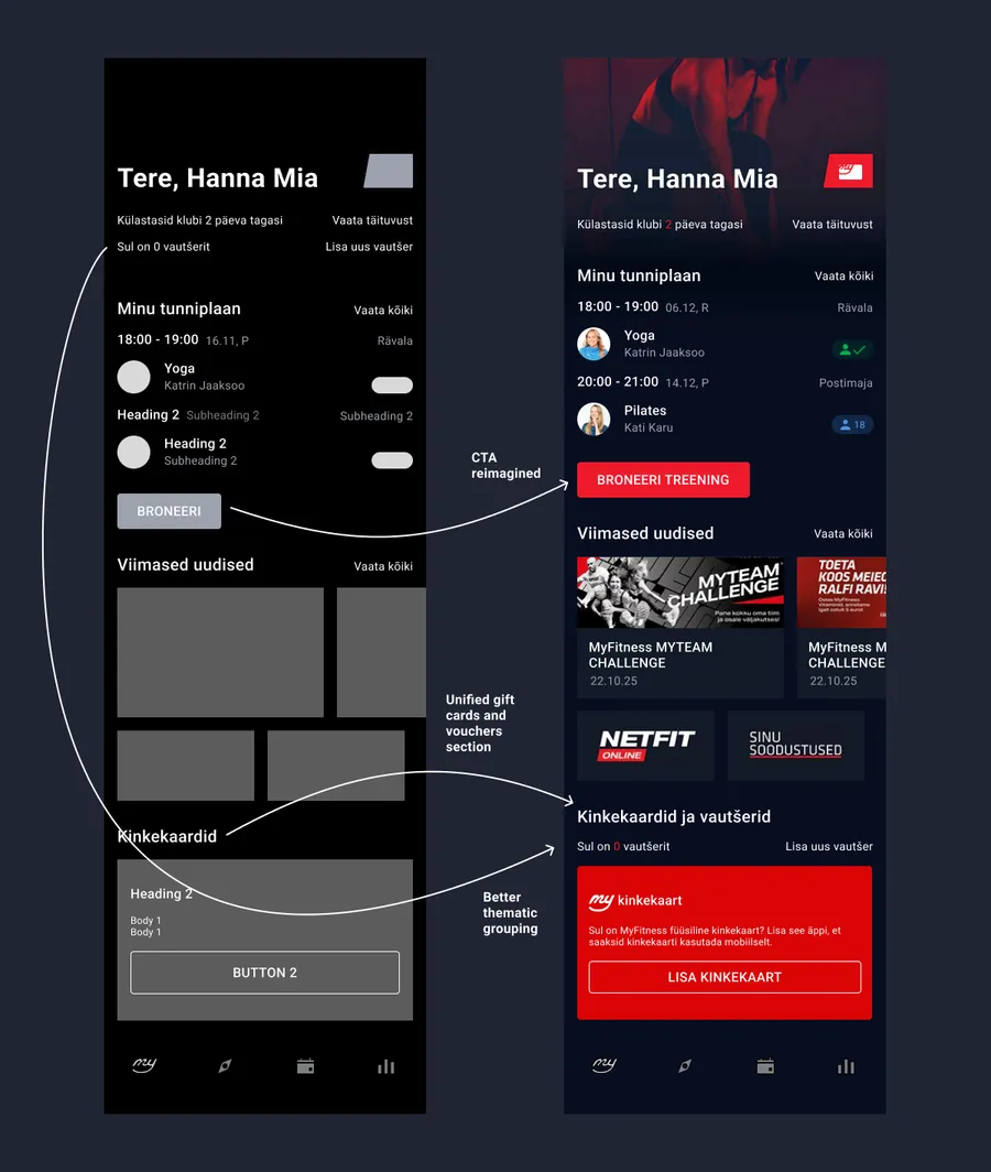
New changes after feedback for creating the high-fidelity prototype
Impact
This redesign demonstrates how strengthening visual structure, without altering core functionality, can significantly elevate the overall look and feel of an interface.
- Improved Scannability: The new typographic hierarchy allows users to read and navigate content much faster at a glance.
- Intentional Feel: The grid alignment and intentional grouping resulted in a layout that feels professional, structured, and polished.
- Visual Elevation: The project proved that even highly functional apps can be elevated by a well-defined visual system without confusing the existing user base.
Complete overview of all changes in the app