

2026 · Product Design · UX/UI · Design Strategy
Restructuring an Independent Real Estate Platform Website
Translating complex legal and business logic into a clear, reliable system that gives property owners the confidence to sell without a realtor.
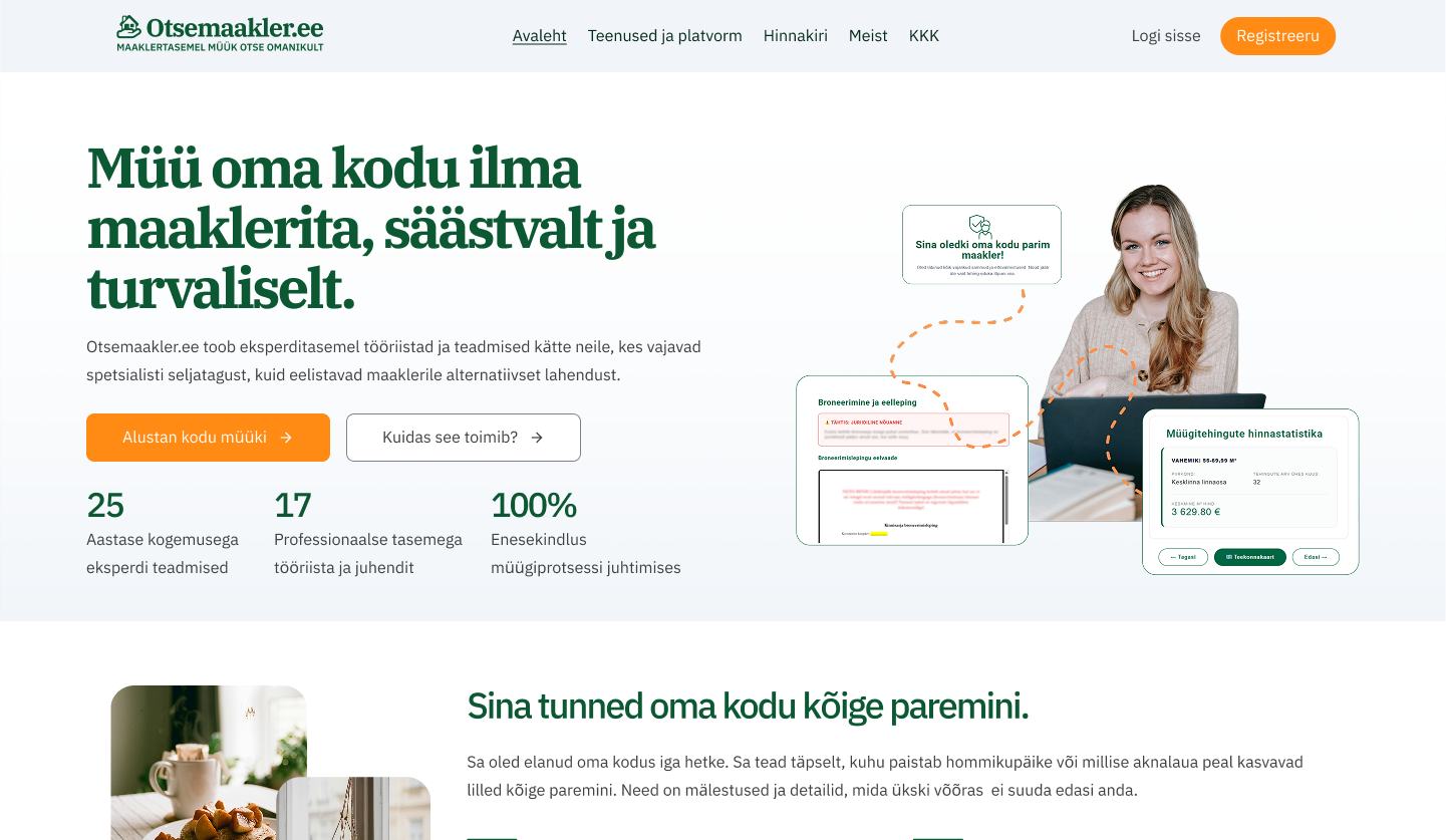
Challenge
Selling a home independently is a high-stakes process filled with legal uncertainty. The existing platform felt fragmented and lacked the structural and educational clarity needed to make users feel secure enough to commit.
Role
Led the visual overhaul, user experience restructuring, and marketing strategy. Analyzed user drops via GA4 and realigned the platform's architecture with user anxieties and business goals.
Outcome
Delivered a new brand manifest, a focused marketing plan, and a cohesive design system that transforms a complex, overwhelming transaction into a calm, predictable step-by-step process.
Context
Real estate transactions are traditionally gatekept by agencies. When property owners decide to handle a sale on their own, they save thousands of euros but are often forced to jump straight into deep waters with zero guidance, facing immense stress and legal jargon.
The focus of this project was to rebuild a platform designed to bridge this exact gap. It acts as a reliable middle ground between a costly full-service agency and going it completely alone, providing structured information and interactive tools.
For me, creating a caring user experience here means building a bridge of trust. It is about comforting the user’s very real anxieties by being entirely transparent, ensuring they can clearly see the value and guidance they receive before ever paying. By blending reassuring language with a clear system, the design demystifies the process, helping homeowners realize that traditional agents aren’t their only option anymore.
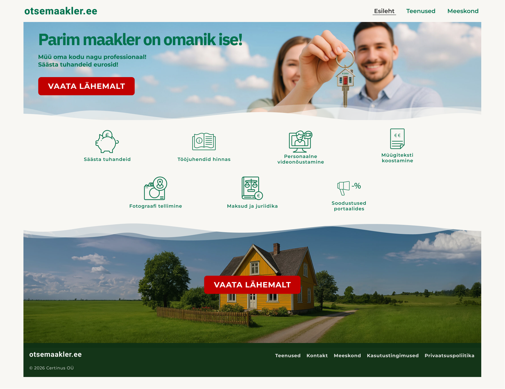
The original landing page layout, which relied on repetitive call-to-action buttons and lacked a clear, trustworthy visual hierarchy.
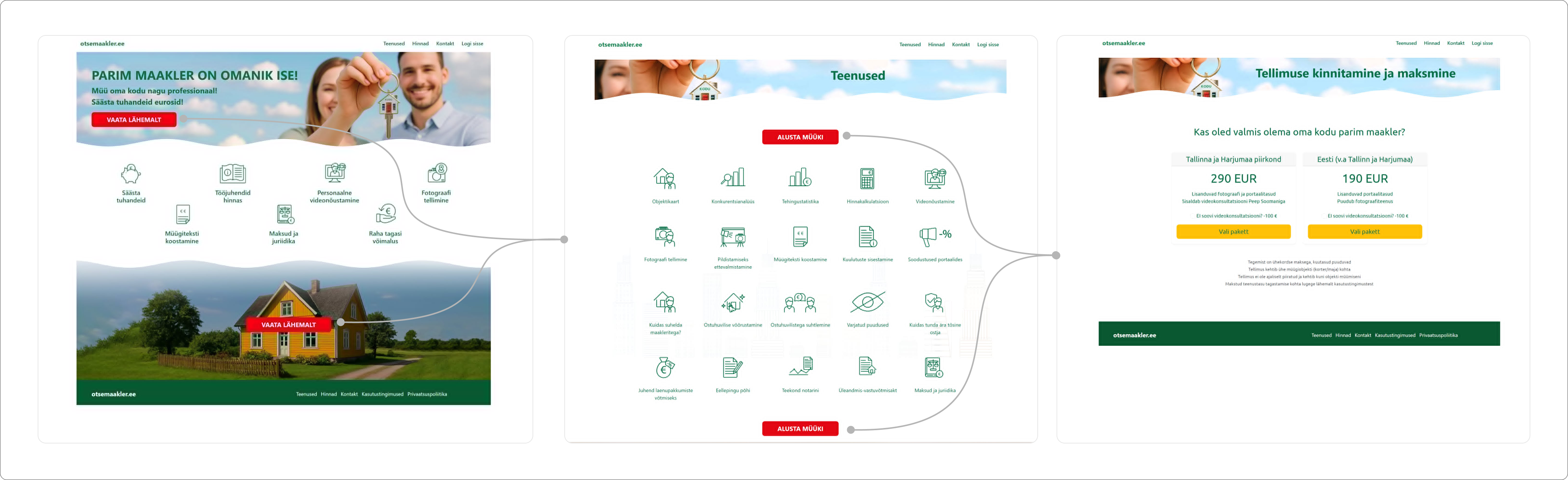
The original user flow was heavily layered and pushed extra required actions onto visitors, creating friction that harmed conversions.
The Process: Finding the Balance
1. Diagnosing the Friction
I started by looking at how users were interacting with the existing platform. By analyzing user behavior through GA4, I identified key moments where people dropped out of the funnel, usually due to sudden uncertainty about the next step. I summarized these insights and systemic gaps into an extensive audit report to guide the redesign.
2. Identifying the Core Challenge
The core challenge was finding a realistic balance between the team’s business goals for package conversions and the deep need to build trust with the user. Because users are understandably worried about managing such financial transactions themselves, the platform had to clearly establish what the platform exaxtly provides, who was behind this information and why it could be trusted.
3. Understanding the Homeowner
I spent a lot of time digging into the profile of an independently selling homeowner to ensure the platform could fade these users’ anxieties and present the guidance in a simple, reassuring way.
I shifted the platform’s position from a confusing setup to a steady, reassuring guide. I additionally wrote a new brand manifest and a clear marketing roadmap built on directness, transparency, and honesty. The goal wasn’t to leave the user guessing, but to give them a completely transparent view of the tools and guidance they would receive, comforting their worries before asking for any financial commitment.
The Solution
The new design addresses the main anxieties of the process through three clear, interconnected updates to the interface and content strategy.
1. Grounded Visuals and Content
To build immediate, calm trust, I focused on a clean, organized hierarchy in both the typography and content layiout. The design relies on structure and clarity to project reliability, making the user feel genuinely supported by an expert-created platform.
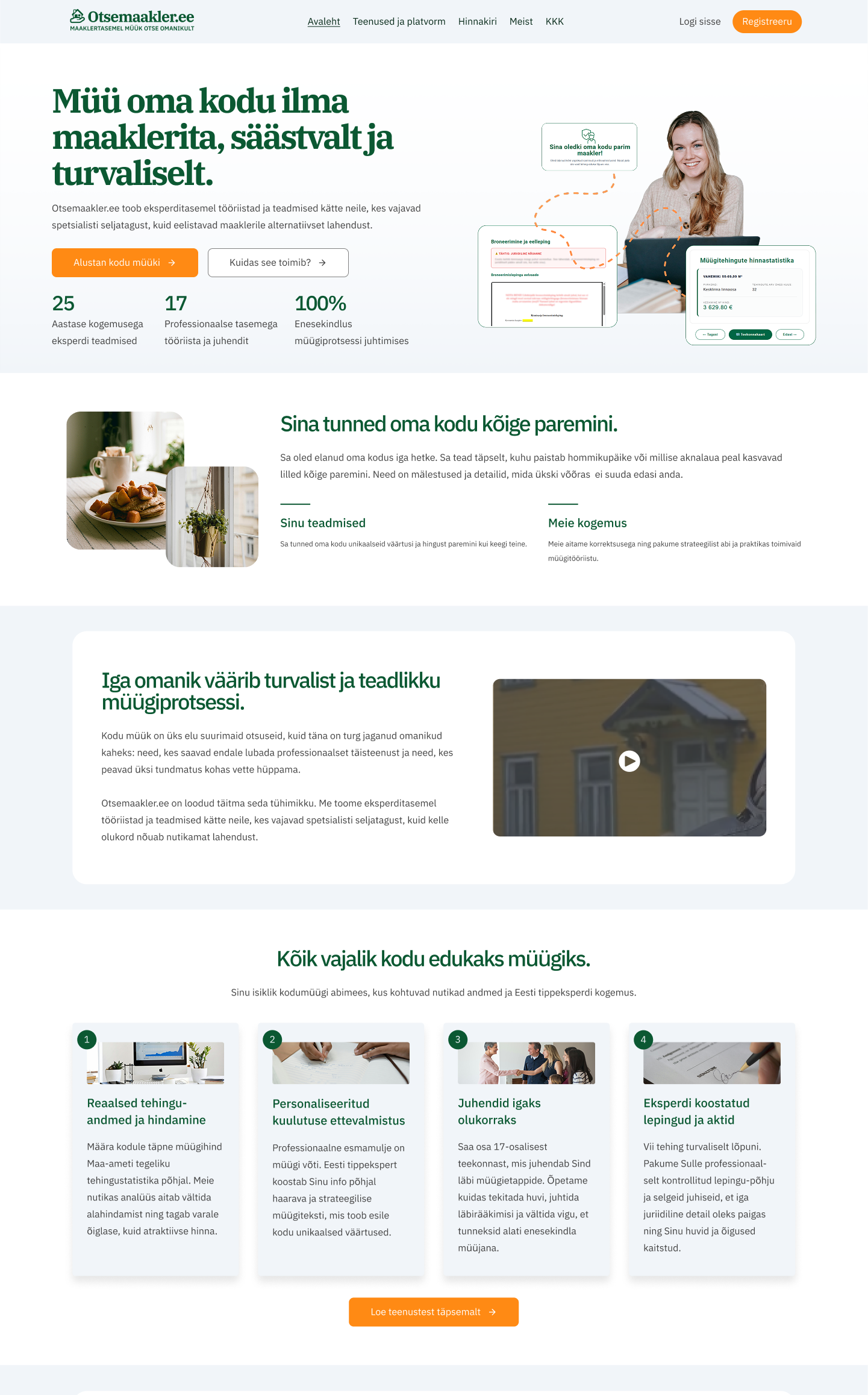
The redesigned landing page: Clean typographic hierarchy and upfront trust anchors that immediately clarify the platform’s expert background.
2. Personal Support
To position the platform as a genuine alternative to traditional realtors, I moved away from the cold and generic, function-only legacy style. Instead, I introduced real human availability, like dedicated touchpoints inviting users to pause and talk over their specific needs. Showing there is caring backing behind the screen transforms the experience from a rigid tool into an approachable, empathetic helper that homeowners can actually rely on.
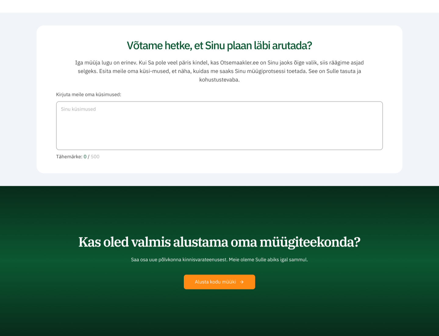
The human touchpoint feature: Moving away from function-only blocks to actively invite user engagement and address specific selling anxieties.
3. Transparent Offering
I restructured the way Otsemaakler’s features were displayed so that the exact interactive tools and information the platform offers in which package. This ensures full transparency so users see exactly what they get beforehand, directly aligning our business goals with the user’s need for reassurance.
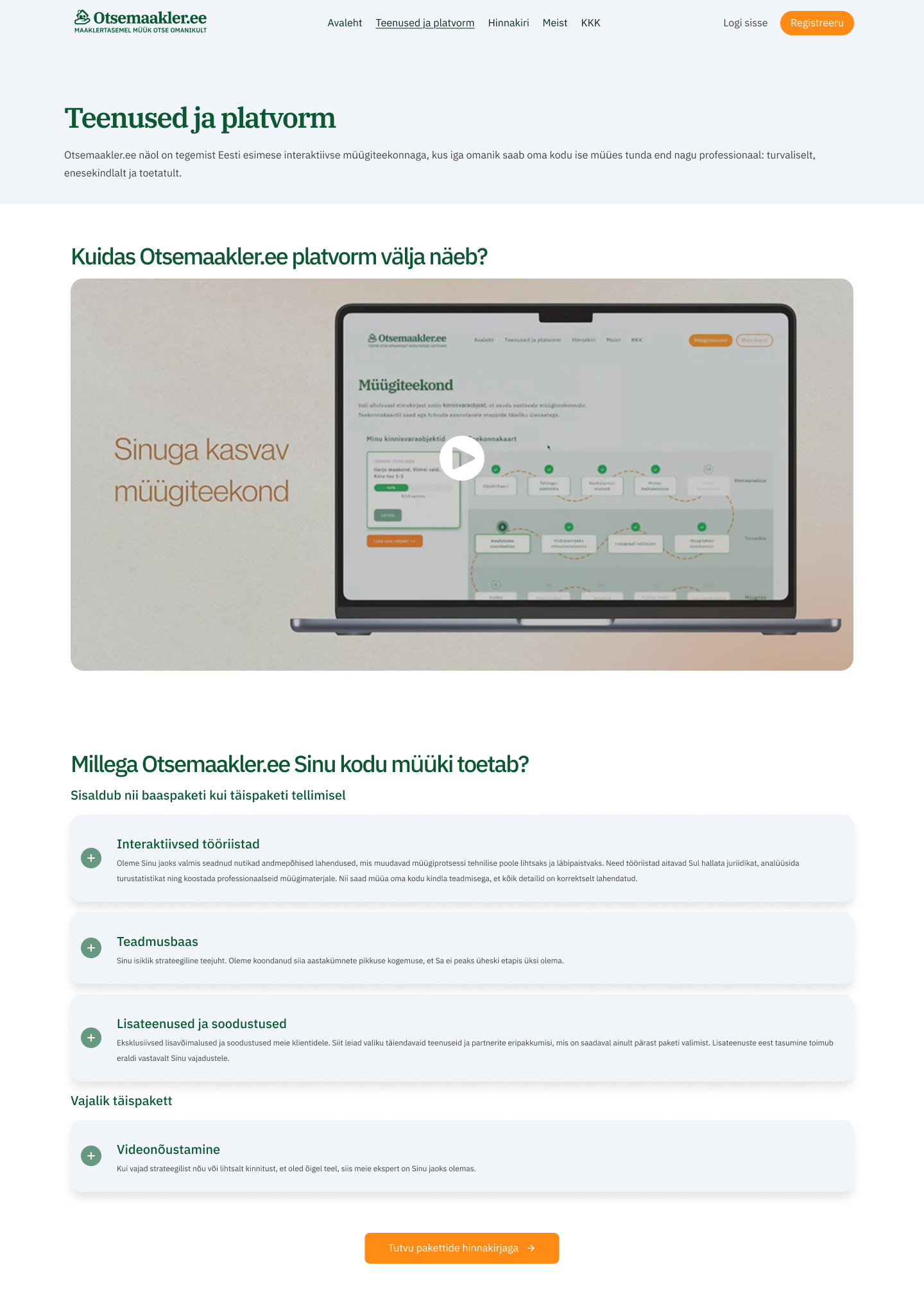
The restructured service overview. Features are logically grouped and categorized into clear, digestible buckets so users can easily grasp the exact tools and value included in each package at a glance.
Current Status
Because this is a startup environment, the official market launch is currently on hold while the team secures its next funding cycle. The foundation is entirely ready. Once full marketing operations resume, the platform is in a much stronger position to scale, ease user anxieties, and convert users compared to the legacy version.
Reflections
This project brought out what I enjoy most about design: the ability to take complicated business logic and turn it into something clean, calm, and usable.
I don’t look at product design as just creating a beautiful interface. For me, it is about understanding data, constraints, and human behavior deeply enough to build a solid system that supports the users and quietly supports the business goals at the same time.