Project Overview
Trajectory Viz is an R-based visualization tool designed to display patient treatment trajectories as chronological event sequences. While the tool offered powerful analytical capabilities, its initial version lacked a cohesive user experience, making complex data analysis overwhelming for clinical researchers.
Trajectory Viz was originally developed by Pajusalu et al. as an R-based tool for visualizing patient treatment trajectories. My role in this project was to lead a dedicated design thinking iteration focused specifically on the redesign of the user experience (UX) and interface, moving the tool from its initial functional state to a user-centered analytical dashboard.
- Role: UX Researcher & Designer (Redesign Iteration)
- Timeline: Autumn 2024 – Spring 2025
- Tools: Figma, R (Shiny), Design Thinking Framework
The Challenge
The primary challenge was finding the balance between data simplification and necessary detail. Users struggled with an overloaded single-page dashboard, unclear filtering logic, and a lack of visual hierarchy, which slowed their ability to draw accurate clinical conclusions from complex health data.
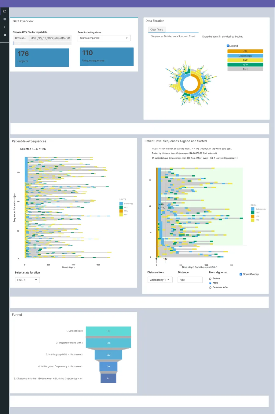
Original TrajectoryViz design developed by Pajusalu et al.
Research & Empathize
To understand the pain points, I conducted a qualitative study using semi-structured interviews and Think-Aloud usability testing.
Key Findings:
- Cognitive Overload: The dashboard felt cluttered, and users didn’t know where to start.
- Filtering Confusion: It was unclear which filters affected which charts, and the “Before/After” sorting logic was counter-intuitive.
- Hidden Data Meaning: Elements like the grey color in sequences (representing time between events) were not explained, leading to misinterpretation.
Define & Ideate
Using the How Might We (HMW) method, I framed the problems as design opportunities:
- How might we help users find essential filtering information and intermediate results quickly?
- How might we ensure charts remain clear even with limited data?
After extensive ideating and using theoretical research for idea validation, I decided to move from a single-page layout to a tab-based structure to separate broad data overview from deeper sequence analysis.
The Solution: A Data-First Redesign
The redesign focused on three pillars: information architecture, interactive clarity, and visual transparency. I chose to keep the original charts and color palette exactly as they were, as these were deliberate, functional choices made by the creators that already worked well for the data.
1. Tabbed Information Architecture
I split the dashboard into two distinct views:
- Overview and Filtration: For high-level cohort selection.
- Event Sequence Analysis: For detailed sorting and comparative analysis.
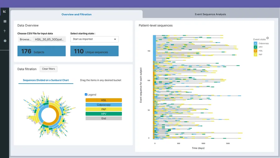
New solution with tabbed layout
2. Clear Contextual Sorting & Filtering
- Relocated Controls: Sorting tools were moved directly next to the charts they affect.
- Intuitive Labels: Renamed “Select state for align” to “Align sequence by Event 1” and added tooltips for clarity.
- Interactive Legends: Added a feature to toggle specific data points on/off by clicking the legend, reducing visual noise.
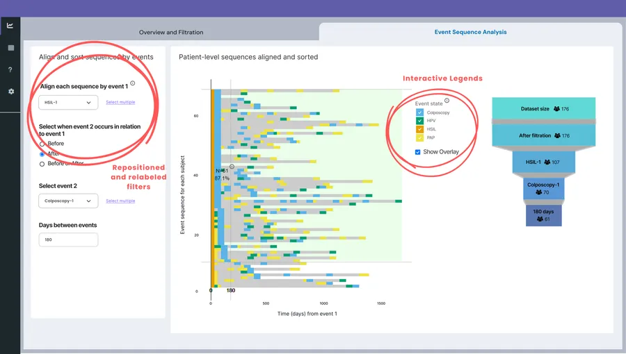
New solution tab for detailed sorting and comparative analysis
3. Visual Transparency
- Tooltips for Metadata: Added explanations for the “grey areas” (time between events) to ensure users understood they weren’t medical events.
- Dynamic Funnel Integration: Integrated the funnel chart next to sequences to provide a real-time view of how many patients remain in the cohort after filtering.
Testing & Results
The high-fidelity prototype was then tested with the original users.
The Impact:
- Better Categorization: Users found the two-tab system significantly more logical for their workflow.
- Improved Logic: The new placement of “Before/After” toggles made the temporal relationship between events much easier to grasp.
Reflections
This project highlighted that in data visualization, UX is just as important as the algorithm. Even accurate data loses its value if the user cannot interpret it efficiently. Future iterations could focus on automating multi-event selections even more and enhancing the intuitiveness of the funnel chart.